Css Fonts - The Basics
Fonts are everywhere and are part of the top 5 most important features contributing to the overall feel of your website. With this said I'm always surprised to discover most designers either didn't learn or have forgotten the essential basics of web typography. This article will explore the industry accepted typesetting standards with a focus on readability and cross browser compatibility.
The Word Wide Web
Anybody who has used Word, Photoshop, Illustrator, Indesign etc will undoubtedly have discovered the plethora of font related options. Colour, size, type style, weight and so on. Most of us understand enough to get by and as such rarely delve much deeper into the subject.
When you do start to experiment however the options which initially may have seemed unuseful, irrelevant or indeed completely pointless suddenly become invaluable tools in your design arsenal. It is at this point you realise that the little letters on your screen are now works of art that, over thousands of years, developed long-established principles demanding pixel perfect precision.
This understanding of typographic etiquette separates the professionals from the novices and a knowledgable designer will immediately know whether the creator knew his typography.
Terminology
The distinction between font and typeface is that a font designates a specific member of a type family such as roman, boldface, or italic type, while typeface designates a consistent visual appearance or style which can be a "family" or related set of fonts. For example, a given typeface such as Arial may include roman, bold, and italic fonts.
As the range of typeface designs increased and requirements of publishers broadened over the centuries, fonts of specific weight and stylistic variants have led to font families, collections of closely related typeface designs that can include hundreds of styles. A font family is typically a group of related fonts which vary only in weight, orientation, width, etc., but not design. For example, Times is a font family, whereas Times Roman, Times Italic and Times Bold are individual fonts making up the Times family. Font families typically include several fonts, though some, such as Helvetica, may consist of dozens of fonts.

Okay, so that's enough said about the history and importance of web typography, so slide your notes about HTML5 <aside> (see what I did there?) and get ready to brush up on your typesetting skills.
Defining The Typeface
Okay we're going to start by outlining what properties can be called upon in our style sheets to alter the way fonts are displayed.
Font-Family:
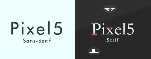
The choice of font family you make is important and will change according to the project. The prevailing feeling amongst the web design community however is that only sans serif fonts (ones that do not have the small projecting features called "serifs" at the end of strokes) are suitable for body text. We are not completely ruling out the use of serif fonts for your main body but our main concern should be maintaining aesthetics across platforms, which is easier accomplished with sans serif fonts, especially when a Windows user doesn’t have ClearType enabled on their PC.
Moving swiftly along from the subject of preference, one must begin analysing the technical elements relating to various typefaces.
The first consideration is the breadth of the family of fonts you are going to choose. Does the font package include all of the necessary bold, italic and everything in between styles? This consideration isn't as important for titles as it is for the body, which, without the full range of fonts, will become difficult to follow through the lack of required emphasis.
A designer who has the a full spectrum of font variations at his disposal is much less likely to have to rely on the often ugly "faux" styles that are applied to a normal font when an italic or bold variation is called. Typefaces were not created to behave this way. Using the styles included with the chosen font family like "Open Sans" are not only going to make your typography much more visually appealing but also more accessible. Dedicated glyphs are always much clearer than those on a normal font face that has been leaned over a bit.
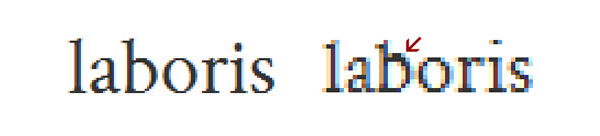
Our second, and often misunderstood consideration, is how the font renders. The vast majority of fonts look fantastically beautiful as they are, but don't render well at smaller sizes. This is why you often see designers use embedded fonts for headers and then count on system fonts such as Veranda for the main body of text.
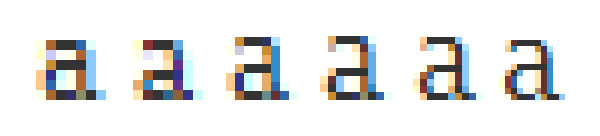
Veranda has a distinct advantage in that it is a "well hinted" font. Delta hinting is the tricky and laborious task by which the creator of the font embeds information within the font that is designed to enhance how it renders at small sizes. Specifically, how many pixels make up individual glyphs in order to keep the font clear and readable. As embedding fonts becomes more commonplace font designers are taking more care to include this information. We can still see an example of this distraction in action with a favourite font of mine, Crimson.
The bunching of pixels does little to help the readability of a body of text.
The font-family: property will set which font is displayed. This property can contain several values as a "fallback" system. If the browser does not support the first font, it tries the next font.
There are 2 options for the font-family property:
- family name - this is the name of a font-family, such as "times new roman", "courier", "open sans", etc
- generic family - this is the name of the family of fonts the name belong to such as "serif" or "sans-serif"
font-family: "Open Sans", Helvetica, Arial, Verdana, Sans-Serif;
Font-Style:
The font-style: property will specify the font style for a text.
There are 3 options for the font-family property:
- normal
- italic
- oblique
font-style:italic;
Font-Variant:
The font-variant: property specifies whether or not the text should be displayed in a small-caps font.
There are 3 options for the font-variant property:
- normal
- small-caps
- inherit
font-variant:small-caps;
Font-Weight:
The font-weight: property specifies how thick or thin characters in text should be displayed.
There are 3 options for the font-variant property:
- normal
- bold
- bolder
- lighter
- numeric value 100 - 900 (Defines from thin to thick characters. 400 is the same as normal, and 700 is the same as bold)
font-weight:bold;
Font:
The font: property an immensely tool that can set the style, variant, weight, size, line height and font family, cutting out the requirement for a lot of the properties listed above. Especially useful for setting high level element attributes.
font: italic bold normal large/1.6em "Open Sans", Helvetica, sans-serif;
The above code would set the text of the specified element to an italic style, a bold weight, a normal variant, a relative size of large, a line height of 1.6em and the font to Open Sans or sans-serif depending on whether the browser could find our first choice typeface.
Size and Measure
Font Size
A recent study carried out indicated that designers begin to negatively effect legibility once they start to use a font below 16px in size. It just so happens that this is also the default font size of all web browsers. With this said it makes sense that we express 16px as 100% in the declaration block for the body in our CSS. It is important if we want our paragraph to be smaller or bigger than 16px we edit this in the body block using a percentage as a result of the differences between browser font scaling.
It is also important that we normalise the size of default text so we can use ems as a multiplier for defining the size of our textual elements. This is because ems are relative units, just like percentages, which means it is much easier to manage our stylesheets and maintain the perceived important of headings.
Even changing the font size a little bit with some font families makes the world of difference
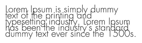
Measure
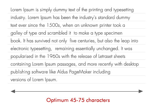
Measure is the amount of characters that a line of text contains. Selecting a measure that is comfortable to read is important for usability. If your line of text is too long then tracking back to find the next line will become difficult, causing your readers to skip lines or misread them. In The Elements of Typographic Style, Robert Bringhurst puts a good measure at somewhere between 45 and 75 characters, far more than the the internet's actual average of 87. This is where we can use the max-width: property in fluid layouts to prevent lines becoming too long.
The bunching of pixels does little to help the readability of a body of text.
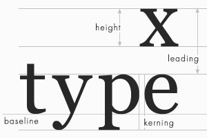
Vertical Rhythm
Leading
Leading, or lead strips are added between the lines of letters when additional vertical space is required. In CSS we use the property line-height: to control the vertical space between lines. Instead of accounting for space between lines, as done in the traditional sense of leading, line-height is a vertical measure of the entire line — including the text itself and any spacing which follows.
There is a fine line between adding too much and providing too little space between each line. Add too much and your text begins to look fragmented and disjointed, leave too little and your text becomes difficult and stressful to read. There is only one correct way to set your line height and that's to use a unit-less numerical value. As a rule of thumb we should set our line height to 1.5 it will always be 1.5x the height of our font, perfect.
I think it's important to note here that although a line height of 1.5 is fairly well tested and common place, not all fonts are the same. Some have unusually long descenders, which would benefit greatly from increasing leading.
Don't mix relative and absolute values.
Conclusion
I understand here that many of the above tips go against standards set in the publishing industry. Walk book in hand into an editors office having applied the above rules to your typography and you'll be thrown out and tried for murder. It goes without saying though that this is a website and websites are interacted with differently to books. Most people scan web pages, skip past chunks of content and are often looking for their next click. So it's critical that you don't alienate people, causing those to bounce who would have otherwise stayed if your content was more decipherable. Remember, if visitors are happy reading your type, they are more likely be comfortable with what you are writing about.

Books and websites are like apples and oranges.
Follow Us


